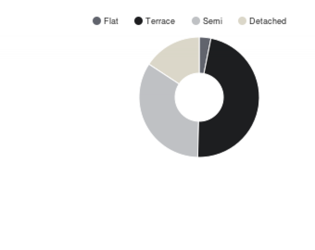
We've used a donut chart (excuse the American spelling) to illustrate the mix of properties that have sold in the last 12 months. Given the profile of the housing stock in the area, there's nothing too surprising here, but it's interesting to see how the different types of properties are represented in the local market.
Popular posts like this
Socio-demographics
By The Protheroe Property Team on 20th Mar 2018,Read this article
Freehold & Leasehold
By The Protheroe Property Team on 28th Nov 2016,Short video touching on the basic difference between Freehold & Leasehold properties...
Love will tear us apart again
By The Protheroe Property Team on 14th Feb 2017,Love will tear us apart again...
Prices by type over the last few quarters
By The Protheroe Property Team on 14th Mar 2018,Read this article
Share this with
Email
Facebook
Messenger
Twitter
Pinterest
LinkedIn
Copy this link